Accordion, Text and Titles (Headings)
Widget Categories: Basic
The accordion widget helps visitors find exactly the information they are looking for easily. Add it to your sites and visitors do not need to scroll through blocks of content they are not interested in. Instead, they can be shown a list of questions or titles and simply choose to open the ones they want to read more about. Create compact and easy-to-read FAQs, product highlights, or upcoming events.
Dynamic Content
This widget can also display dynamic pages as well as specific collection or product information using Inline Binding. For displaying dynamic pages, see Display and Navigation Options for Collection Records. For information on adding widgets, see Add Widgets
Content Editor
The option to access the content editor is available in the floating menu. Click the element to open the floating menu, then click the option for the content editor.
Accordion Setup Options
- Items - Click an item to configure its content, click the duplicate icon to duplicate an item, or click +Add Item.
- Display Rules
- Show one expanded item at a time. Set it so visitors can expand only one item at a time or can view several expanded items at the same time.
- Show first item expanded. Set it to show the first item expanded or have them all collapsed.
- SEO.
- Enable FAQ Schema. Enable this toggle to generate FAQ schema markup once per page. To test if your schema was generated properly and see a preview, use the Rich Results Test.
Individual Items Setting and Options
- Textual Content - Title/question and description.
NOTE
The long text field provides various text formatting options, such as italicizing, bolding, or underlining text.
- Button - If a button isn't desired, click the eye icon to hide it.
- Media (image or video) - Add desired media. Select Click to add media to open the Media Library.
- Alt text - Once Media has been added, an Alt text field will appear. Type your own alt text . Repeat for each individual piece of media in the Accordion or click All Alt Text to view and manage alt text for all site images.
Design Editor
To access the design editor, select Edit Design from the floating menu to open the design panel. Click the element to open the floating menu, then click the option to edit design. The following are some of the sections and settings that can be found:
- Layouts - Click the layout thumbnail to select a layout.
- Title:
- Select the heading type (h1-h6 is available) and style text as desired.
- Style the title bar as desired (background and border).
- Expansion icon - While the icon itself can't be changed, you can customize its elements, such as adjusting its size and color, as well as modifying its background.
- Media - If images will be included in the content of the accordion items, configure them here.
- Frame - Various settings can be found in this section, including adjusting the space between items. For information about design options that are not specific to this widget (for example, layout, style, or spacing), see Widget Design
NOTE
- Changing the layout of the accordion widget may override some of the settings you have defined (for example, spacing between items). Check all settings after editing the widget and recreate any ones that are missing after you change the layout.
- Make sure the design settings you define are correct per device. As usual, settings such as spacing (of the whole widget and individual items), width and more are defined per device.
Widgets: Text and Titles (Headings)
The text and title widgets offer a wide range of customization options, most of which are accessible through the text toolbar. With this simple editing interface, you can easily change the font, color, alignment, and style of your text. The text toolbar allows you to quickly make adjustments to highlight key points and effectively organize information on your site. For information on adding widgets, see Add Widgets
TIP
For more information on widgets and the widgets library, see Widgets: Library and Overview
There are three text widgets that can be found in the widget library:
- Text
- H1 (Large Title)
- H3 (Small title)
Once a text widget is added to a site, you can easily switch between different text options. For example, if you add a Text widget but then decide you want it to be an H2, you can make that change directly in the text toolbar. The available text types are: Paragraph, H1, H2, H3, H4, H5, and H6.
Edit Text (Paragraphs and Titles)
To edit text on your site:
- Click the text you want to edit to open editing mode.
- Select the text you want to edit by clicking and dragging over the text.
- Use the inline editing options in the bar above the text to edit text styles, sizes, fonts, alignment, add links, and more
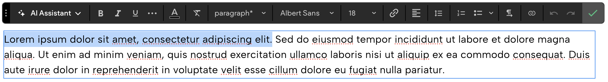
Text Tool Bar

| Number | Setting/Option Name | Description and Notes |
|---|---|---|
| 1 | AI Assistant | Generate content quickly and work more efficiently with the AI Assistant. For more information, see AI Assistant for the Text Editor. |
| 2 | Basic formatting options | Bold, Italicize, and Underline selected text. |
| 3 | More formatting options | Click on the horizontal three-dot icon to find the following options to apply to selected text: Letter spacing, Text shadow, Strike through, All Caps. |
| 4 | Text color | Change the color of the selected text. |
| 5 | Clear Formatting | Reset selected text to the format set in the site's theme. For additional information on theme text, see Theme Text. |
| 6 | Text type | Select the type of text: paragraph, Heading 1 (H1), Heading 2 (H2), Heading 3 (H3), Heading 4 (H4), Heading 5 (H5), Heading 6 (H6). All text will be converted to the selected text type. If the style of the text has been manually changed and you want to apply the changes to the theme text, use the Update theme option located at the bottom of the drop-down list. |
| 7 | Typography settings | Change the font family and text size for the selected text. This will disconnect the text from the theme text. To reconnect it, click the Clear Formatting icon (labeled as number 5 in both the table and the screenshot). |
| 8 | Scale text | (Editor 2.0 only) Click the Scale Text icon to enable your text to scale based on the parent container's width. This is helpful when you do not want a line break in a heading. Note this can be enabled at the Theme level. To learn more, see Site Theme. |
| 9 | Link text | Add a link to the selected text. For more information on the link picker, see Link Picker. |
| 10 | Alignment | Change the alignment of all text in the widget. |
| 11 | Line height | Change the line height of the selected text. There are preset options available as well as custom. |
| 12 | List options | Turn selected text into a numbered or bulleted list. Use the down arrow to change the bulleted list style. For more on lists, see Bullet and Number Lists. |
| 13 | Text direction | Change direction of the text. |
| 14 | Connect to data | Connect a string of text to data rather than the full text widget. |
| 15 | Undo and Redo | Undo or redo the previous change. |
| 16 | Exit edit mode | Click the check mark to exit out of editing mode for the widget. |
Bullet and Number Lists
Create a bullet or number list using the text tools inside the Text widget. Lists are a good way to group content, features, or products so that visitors can quickly understand and compare information. To add a bullet or number list:
- Click the text you want to make into a list.
- Highlight the text, and click the Bullet list or Number list icon on the text toolbar.
- (Optional) To select a different bullet style, click the down arrow next to the Bullet list icon.
- To create nested bullets and lists, press the Tab button on your keyboard. The bullet or number is shown indented to the right. You can have multiple nested bullet and number lists.
Design Editor
To access the design editor, select Edit Design from the floating menu to open the design panel. Click the element to open the floating menu, then click the option to edit design.
The design options in the design editor apply to the widget itself, such as adding a background.
To style the text within the widget, use the text toolbar. However, if the widget is connected to data, text settings will be available in the design editor instead. Keep in mind that when you customize text settings in the design editor for data-connected widgets, these changes will override the site’s theme settings and break the connection to the theme. As a result, future changes to the theme won't affect the text in this widget. For more information, see Theme Text.
For information about design options that are not specific to this widget (for example, layout, style, or spacing), see Widget Design
Features and Limitations
- Text sizes can be up to 500 px.
- Multiple types of text can be contained in a single text element. For example, Heading 2s, paragraph, and Heading 3s can all be used in the same element. The text should be on its own line, separated by pressing the Enter key.
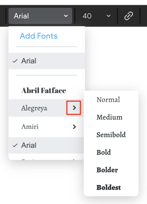
- If a font offers other weights, it can be selected within the font list. To select a font's weight, hover over the font to see the font's available weight options (normal, bold).
- Copy and paste works externally and internally - Pasting from both external locations and within the editor (internal) applies the theme text styles and any inline styles that were applied to the text in the editor. Bold, underline, and italic are maintained from the copied text.
- Custom line height - In addition to the existing default line heights, you can now choose a custom line height.
- Specify letter spacing - To select letter spacing, click the three dots icon in the inline text editor, and
select from the following:
- Auto
- Narrow (-0.05)
- Wide (0.2)
- Custom (between -2 and 0.5 in increments of .01)
- All Caps - To change the font to be in all caps, click the three dots icon in the inline text editor, and click the All Caps toggle.
- Shadow - Select the color and position. • Strike-through text. • More bullet list style options - Click the down arrow next to the Bullet list icon. • Connect text to data - Click the connected data icon in the inline text editor. • There is no option to add a list with heading text. • Bullets of items in a list that have more than one fonts size will use the site theme size.
HTML Tags
Due to HTML5 best practices, we do not allow updates to the HTML of the text with a non-supported
tag.
To add a specific style to the text, we recommend adding it to the CSS.
The following tags are supported via developer mode: img, sub, sup, blockquote, code
Update to New Text Editor
The new text editor includes improved technology for increased stability, a wider range of available text sizes (up to 500px), allows you to use different text styles within the same element, and more. Old text editor:

NOTE
Existing text in your site can be edited using the old text editor, with the option to update to the new editor. All new text will be edited using the new text editor.
To upgrade and use the new text editor:
- Click the text you want to edit to open editing mode.
- On the text editor, click Update text editor.
- On the confirmation message, you have the following options:
- Update this text. Click to only update the text widget you have selected.
- Auto update all texts. Click to auto update all text widgets in your site. Note, only text you click will move to the new text editor without the need to approve it.
WARNING
After confirming the update, you will not have the option to revert to the old text editor.
Troubleshooting
The following may cause the update to the new text editor to fail: • Custom code where the HTML is not valid. • Maximum site CSS storage capacity has been reached.
If your text contains certain tags that are not supported, you may not see the option to upgrade the
editor. The following tags are not supported: form, svg, iframe, audio, canvas, dialog, embed, hr, input, map, picture, select, textarea, range, table, progress, script, ins, style
Updated 3 months ago