Edit Widget: Content and Design
You can customize widgets to adjust the content, appearance, and layout of your site. Editing widgets allows you greater control over what features your site has and how these features behave. Most widgets have an area for its content as well as its design.
Note:
Some widget elements may be display-only depending on their source.
Learn more about editable vs read-only sections here: What Can I Edit in the Website Builder?
Content Area
The content area is where a widget's content is typically configured. The available sections and options in the content area vary depending on the widget. For example, some widgets allow you to add a link, while others do not.
The option to access the content editor is available in the floating menu. Click the element to open the floating menu, then click the option for the content editor.
Edit Design
Most widgets in the editor have design options that enable you to customize the widget's appearance for your site. Not all widgets have the same options. For example, some widgets do not allow you to edit inner spacing, others do not let you change outer spacing.
To access the design editor, select Edit Design from the floating menu to open the design panel. Click the element to open the floating menu, then click the option to edit design. The following are common design settings:
Text Styles
Text size set in specific widgets (Text editor, Contact form, Navigation, Business, Click to Email, Click to Call, and Button widgets) will automatically adjust based on screen size. On desktop, the text size is 100%, on tablet the text size is reduced down to 85%, and on mobile the text size is reduced down to 80%. However, by default the editor will not adjust the text to be smaller than 16 px on mobile or tablet. And it will not adjust to larger than 60 px on tablet or 40 px on mobile. This is to ensure the text is still readable and in proportion to each screen size.
If you need to override the text size per device, you can adjust the text size in the Theme Text and the text will not be reduced per screen size.
Following are examples of how the text size will adjust in different scenarios:
- If you set the text size to 40 px on desktop, the text will automatically be reduced to 34 px on tablet, and 32 px on mobile.
- If you set the text size to 16 px on desktop, it will not reduce by 85% to 13px on tablet, or 80% to 12 px on mobile since that is too small to read and below the 16 px minimum. Instead, the text size will stay the same at 16 px on all screen sizes.
- If you set the text size to 100 px on desktop, it will adjust to 60 px on tablet since that is the maximum, instead of 85 px which would be 85% of the desktop text size. The mobile text size will also adjust to 40 px since that is the maximum, instead of 80px which would be 80% of the desktop text size.
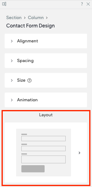
Layout
Layout options are usually specific to certain widgets. To select from the set of layout options available for that widget, click the layout that appears in the Design Editor (or click the small arrow beside it) to open the Select Layout menu. To change the selected layout, click the layout you want to use instead and it will be updated in the widget.
Example layout section in the design panel
Updated about 1 month ago