Features Available in the Editor
The following sections list the features that are available in the Editor .
Note:
Not all elements in the editor can be modified directly.
See this guide What Can I Edit in the Website Builder to learn more on what can be edited in the website Editor
AI, Templates, and Automation
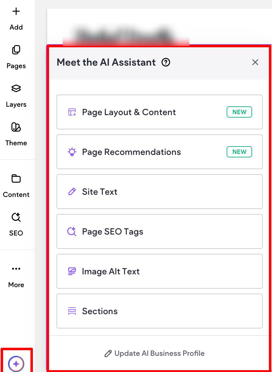
AI site generator
To help speed up the site-building process, you can use our AI Assistant to quickly generate a site
complete with multiple pages, different page layouts, and content based on your client’s business
information and brand guidelines.
Custom color palette in AI site generator
The AI Site Generator can create a custom color palette from an uploaded logo.
Navigation and Layout Control
Mega Menu
A Mega Menu is a type of navigation menu commonly used on websites to organize and display a large
amount of content or options in a structured, visually appealing way. Unlike a traditional drop down
menu that displays a single column of links, Mega Menu expands further horizontally. Common use
cases include eCommerce sites with many product categories, travel sites with many destinations, or
services businesses that offer a wide range of services.
To learn more, see the Mega Menu support article.
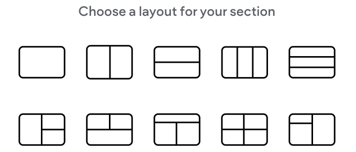
Section layouts on desktop
When you click +Add Section in the editor
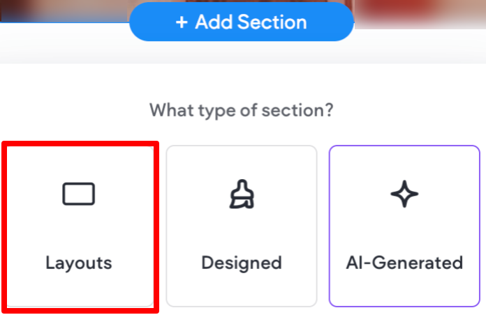
You'll see a layout option with predefined blank layouts to chose from.
Save and add designed sections in the header
You can add both empty and designed sections to your header. You can also save header sections for
reuse in other sites or projects.
Hide per device and on all devices
Easily hide (and unhide) elements per device or on all devices with only a few clicks.
To learn more, see our Manage Elements support article.
Hide footer
To learn how to easily hide the footer per device, see our Footer support article.
Default “bottom” anchor across all pages
In the link picker, you can use the anchor option to link any linkable widget directly to the bottom of a
specific page. To help save you time, the "bottom" anchor is created by default for each page.
Editor Experience and Usability
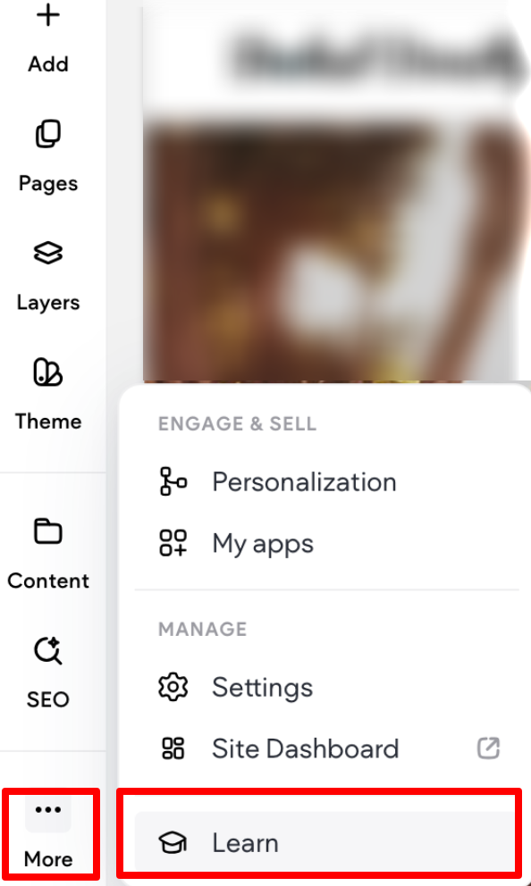
Learn panel
You can quickly hone your advanced design skills and create engaging visual effects in the sites you build. To access the Learn panel, in the side panel of the editor click More, then select Learn.
Layers panel stays open when switching pages
The Layers panel stays open even when switching pages, allowing you to save time and not have to
open the panel repeatedly.
Design, Layers and Learn panels push canvas by default
When open, the Design, Layers, and Learn panels do not cover the canvas and instead push the
canvas to the side so that you can still see everything.
Granular inner column (space between elements) control
You can set the default spacing for new inner columns. This allows you to have granular control over
the space between elements.
To learn more, see the Site Theme support article
Design and Styling Enhancements
Responsive text
When text scaling is turned on, text size will automatically adjust relative to the screen size of the visitor
seeing your site. This improves readability, responsiveness, and accessibility.
To learn more, see our Site Theme support article.
Color change on scroll
You can set a background color for your section that smoothly changes as the user scrolls through the
section. This can boost engagement by adding a dynamic visual break and signals content transitions.
To learn more, see the Element Backgrounds support article
Set image background per screen size
To learn more, see Background Image Configuration support article
Parallax effect on background image on all screen sizes
Parallax is a design effect where background elements move slower than foreground ones as you scroll
down a webpage. This creates an illusion of depth and a more dynamic, engaging visual experience.
To learn more, see the Background Image Configuration support article
Velocity slider for parallax background image
For parallax background images, you can use the velocity slider to control the speed the background
image moves as the visitor scrolls down the page.
Hover effects on containers
To learn more about how to add a hover effect to a container, see the Animation and Background
section of the Design with Flex support article
Header overlap per breakpoint
You have the flexibility to set your header to overlap with the content in the first row of the page. This
can create a visually appealing effect where the header seamlessly integrates with the content.
Fine-tuned control over site content width
You can control the width of non-full width sections. This can help improve readability, especially for
text-heavy sections like blog posts or info blocks.
To learn more, see Width and Spacing support article
Improved photo editor and remove photo background
We’ve upgraded our image editor so it now includes more options, with the most notable one being removing the background of an image.
Theme spacing for sections and columns
You can define default spacing and width for new sections, columns, and inner columns added to your
site. To learn more, see Width and Spacing support article
Inline margins
For elements inside a column or inner column, you can quickly adjust the element’s margin by dragging
the edges of the element on the canvas in the same direction as the column.
Widgets, Forms, and Interactive Elements
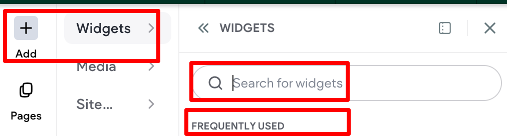
You can select a widget by clicking the “+” (Add) button on the side panel. From there, either search for your preferred widget using the widget search bar or choose one from the frequently used list.
Hamburger widget
The Hamburger Menu widget allows you to place and align the menu icons anywhere in the header, or
even other areas of the site, while adjusting their color, size, and design. You can select from the icon
library or upload your own custom icons.
To learn more, see the Hamburger Menu support article .
Advanced Tabs widget
The Advanced Tabs widget allows site visitors to click between tabs (rather than scroll through text) to
view related content.
To learn more, see the Advanced Tabs support article.
Advanced Accordion widget
The Advanced Accordion widget provides additional design flexibility by allowing you to customize each
accordion item individually. Each accordion section can expand when clicked, allowing site visitors to
quickly access information and scroll past what they do not need. The Advanced Accordion can be
used to compactly display content such as FAQs, product highlights, or upcoming events.
Advanced Form widget
The Advanced Forms widget allows you to build custom forms that drive both engagement and
conversion, and integrate seamlessly with your site design. For example, you can create a form to
collect information about potential customers, gather customer feedback, or offer account and event
registration.
To learn more, see the Advanced Form support article.
Fixed/pinned button
Fixed or pinned buttons stick to their parent element (column or inner column) for as long as the parent
element is in the viewport.
To learn more, see the Pinned Buttons support article.
“Scroll to Bottom” option in link picker
The 'scroll to bottom' linking option in the link picker, when editing buttons and icon
Widgets let site visitors scroll directly to the bottom of the footer.
To learn more, see the Link Picker support article.
Link to a container
You can link to a container (column, inner column, or advanced grid) from the link picker.
To learn more, see the Link Picker support article.
Updated about 1 month ago