Editor Overview
This article covers the areas of the editor and how to add and configure sections, rows, columns, inner rows, and widget alignment.In the editor there are several predefined sections: the top navigation bar, the side panel, the central content area (often referred to as the editor canvas), and the design panel on the side. These sections
are the basis for constructing websites according to the user’s vision.
NOTE:
Not all elements in the editor can be modified directly.
See this guide Editing The Design and Content to learn more on what can be edited in the website Editor
Top Navigation Bar
The top navigation bar contains helpful shortcuts for different site actions.

The top navigation bar allows you to:
- Page Navigation: Click on the pages menu to access a dropdown menu displaying all available
pages on your site. You can navigate between pages by selecting them from this menu. - Switch between different screen size views (also called breakpoints) by clicking on the device icons.
This allows you to preview how your current page appears on various screen sizes, from desktop to tablet to mobile. To learn more, see Screen Sizes and Devices - Feedback Tab: Click on the comment and sparkle icon to provide feedback about the editor. Share suggestions, ask questions, report bugs, or provide other comments.
- Search Functionality: Click on the magnifying glass icon to search for anything you need within the
editor or access the help center for assistance. - Info and Tools: Click on the information icon to access the following information:
- Site Info. Displays the site name, published status, editor version, and a link to the site dashboard.
- Preview Link. Displays the preview link for the site. To copy the link, select the device type and
click Copy. - Stats. Displays basic stats for the site. To see more information, click Open Stats. This information
is only available for published sites. For more information, see Site Stats and Analytics. - Editor Language. Switch the editor language. This does not affect the language of the site. To
switch the editor language, select a language from the drop-down menu.
- Save Progress Indicator: The check mark icon serves as an indicator of your current site progress
and whether changes have been successfully saved. - Undo or Redo: You can use the undo and redo functionalities represented by the back and forward
circle arrows to revert or reapply recent actions performed in the editor. - Preview Changes: Click on the eye icon to preview your site, including unpublished changes, on all
or individual device screen sizes. - Publish or Republish: Use the publish or republish button to publish your site with the latest
changes. - Home Button: Click on the home icon to return to your site dashboard.
Side Panel
The side panel serves as a comprehensive toolkit for managing various aspects of your site's design
and functionality.
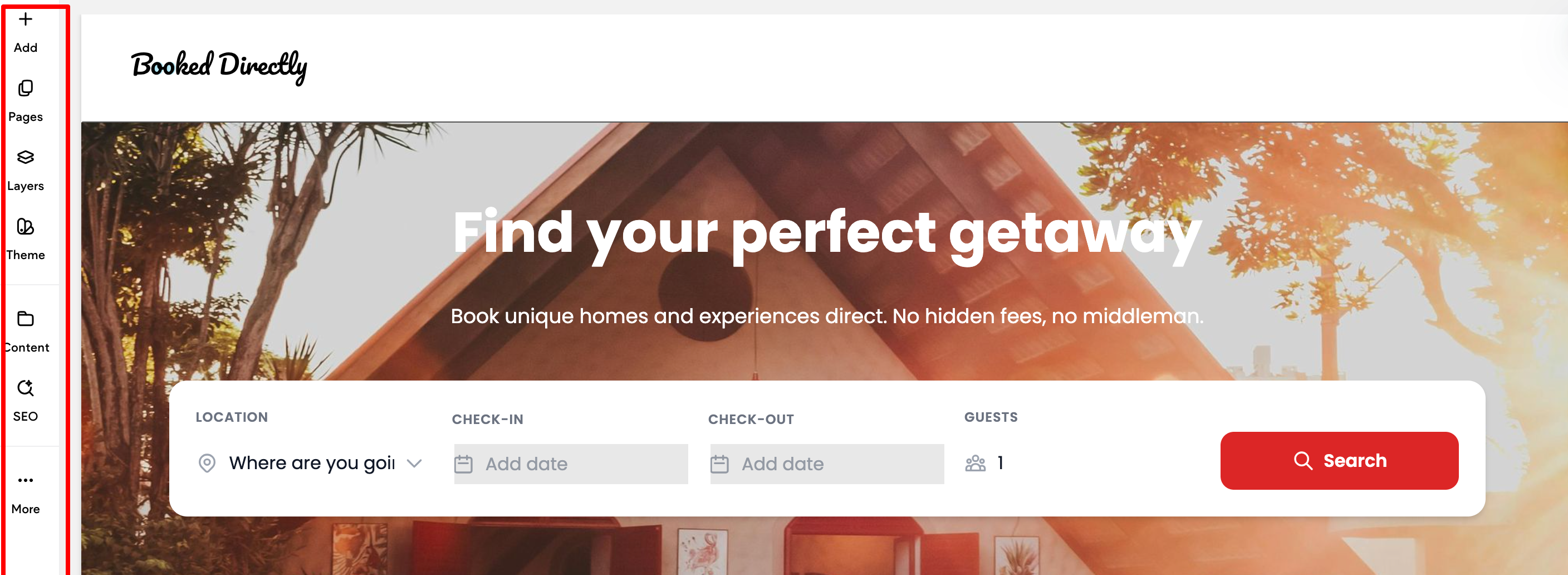
The following are the default options available in the side panel:
- Add. From this element you can easily drag and drop Widgets, Media, and Site Text onto the canvas.
- Pages. Add, view, and manage pages and popups.
- Layers (only available in Classic Editor using flex mode or in Editor 2.0). Provides a hierarchical view
of your site page’s elements, allowing you to easily navigate and manage complex structures. - Theme. Define default styles and settings for all text, colors, buttons, images, backgrounds, rows,
columns, layout, width and spacing on your site. - Content. Manage collections and content collected from clients.
- SEO. Manage SEO settings for pages, images, internal and external links, and more.
- More. Provides access to Personalization, Settings, and Site Dashboard.
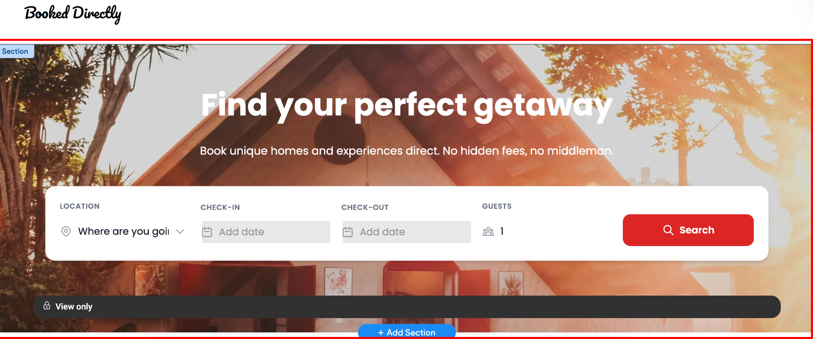
Content Area / Canvas
The Content Area / Canvas is where you can move or add any of our features, or click and edit to
change them. The content area allows you to change images, text, edit and delete buttons, and more.
NOTE
To learn how to add and configure elements on the canvas, see Design with Flex
For more on canvas editing options, see Canvas Actions and Options
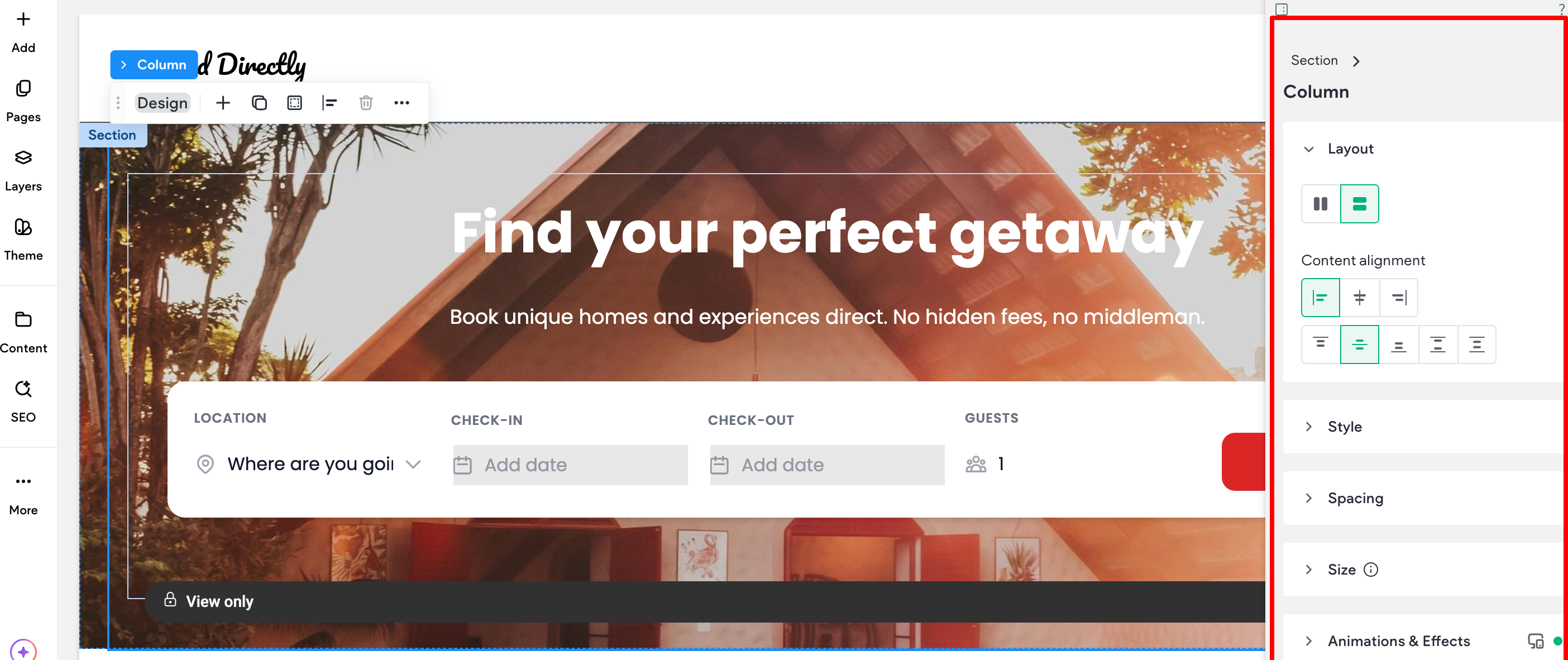
Design Panel
The design panel offers a range of design settings for selected elements, enabling precise customization. Whether you are tweaking layout content alignment, spacing between elements, animation, and
background, the design panel provides a comprehensive set of tools to enhance your website's visual
appeal. Design options include layout adjustments, sizing configurations, alignment settings, and more,
tailored to the selected element
To learn more about the Design Panel and its sections, see Design Panel
Website Builder Structure
The Website Builder is built from a header, footer, rows, sections, and columns. Every widget you add is
inserted into one of these sections.
NOTE
If you are using flex mode, rows are named "sections". To learn more, see Design with Flex..
Rows
Rows are the horizontal sections of your site. When you add widgets and columns to your site, they
are placed within these rows. To change how content is displayed in the mobile view, click the reverse
column order toggle in the row editor.
You can add rows to your site by dragging widgets into the site. When you drag a widget between rows
or into a space where want to add a row, a new row will be created when you drop the widget.
To delete a row, right-click anywhere on the row to open the context menu, and then click Delete.
Alternatively, click the Row button at the top left corner of the row and click Delete.
Background Image Slider
Background Image Sliders can be used to set background images for rows or columns.
After selecting multiple images in the image picker, click Done. Once the slider is created, select a Slide
transition from the drop-down menu, and move the slider to select a Slide speed (seconds).
Any of the other background image options such as Background Overlay, Positioning, and display style
can be applied to the slider.
Designed Sections (Pre-Designed Section Templates)
Sections are pre-built rows of elements which users can add to their responsive sites. Sections enable
users to build great looking sites quickly by saving time during the design process. The infrastructure
was built in order to provide a better user experience with a variety of pre-made sections.
NOTE
- Sections do not use any custom CSS, and are all build within the editor by designers.
- Sections do not use the text color or text font settings from the site theme settings.
However, you can always clear the format and apply your design.
Add Sections
To add sections of widgets:
- Hover between rows, and click Add Section.
- Select Designed. Sections display in the side panel.
- In Section Mode, a gallery of pre-made sections is available in the left panel, grouped into categories (Intro, Features, About, Team, Testimonials, and so on).
- In the side panel, click a section to display it as a new row. You can then browse sections within the
same group by using the arrows keys or by selecting a section from a different group. - To embed the section into the site, click Save. Alternatively, click Save & Add Another to continue
adding sections to your site. The section converts into a row and all elements in the section are
editable.
Widget Alignment
When aligning widgets within the same column, the website builder attempts to Snap to Align them to
be the exact same size. As you resize, the builder jumps ahead or behind to snap to location. This
should make it easier to make widgets the exact same size.
There is also a Snap to Grid feature. The Snap to Grid feature helps lay widgets in the pages of
your site with professional precision. This system allows you to align widgets horizontally and vertically
within columns and rows. Rulers are presented when moving an element in its row or column, or when
resizing the widget. The aligned elements are marked with a colored border. A widget may be aligned
with more than one other widget, depending on the specific use case.
Alignment is supported in the views of the three different devices (desktop, tablet, mobile).
Header and Footer
For more information on configuring headers and footers, see:
Updated 23 days ago