Style, Buttons , Spacing & Animation
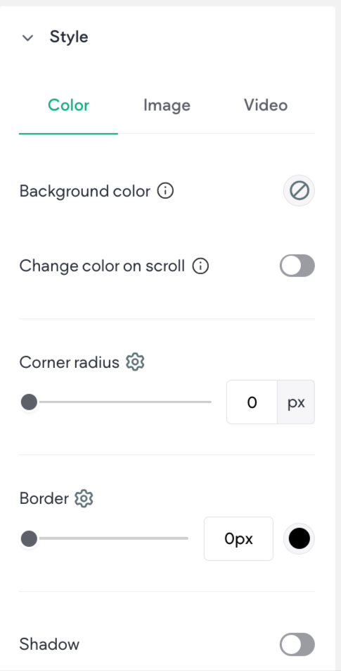
Style
-
Color- Click the round color icon to the right of the setting name to open the color picker and change the color.
-
Border- Change the width of the border using the slider or text box. Click the gear icon for more options.
-
Background- Use a background image or color for this widget using the Choose and Place Images dialog or a video URL.
-
Width and Height- Use the slider or text box to change the number of pixels.
-
Rounded Corners- Increase or decrease the rounded the corners on a widget. Click the gear icon for more options.
-
Shadows- Toggle on or off a shadow for this widget.
-
Text- Set various aspects of the text, such as font family, font weight, etc
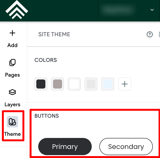
Buttons
Widgets that incorporate a button will offer the ability to select whether the button inherits the primary or secondary button style defined in the theme panel. In addition, you can choose between the different button layouts, make edits to the button style (width, height) and button text (font, text size), and adjust the inner and outer spacing.
Any changes you make within the design editor will override styles set at the theme button level. If you need to revert back to the theme button style, click Reset to theme style.
Primary and Secondary theme Buttons
-
If changes are made to the button (which will override styles set at the theme button level), an indicator box will still be present on the Primary or Secondary button style.
-
If the button style that does not have the indicator box is clicked, it will reset the button to the style set at the theme button level.
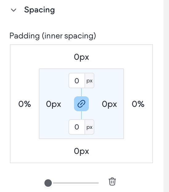
Spacing
Change the inner spacing (spacing inside the widget edges) and outer spacing (spacing outside the widget edges). Each number in the outer box sets the outer spacing for its own side (top, bottom, left, or right), and each number in the inner box sets the inner spacing for its own side (top, bottom, left, or right).
For detailed information, see Outer and Inner Spacing
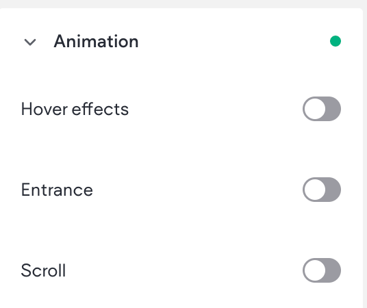
Animation
Entrance animations let you animate widgets and page widgets when they are first loaded on your site. Motion and interactivity makes your site more memorable and can emphasize the sections you want visitors to focus on, like a phone number or a contact button.
Additionally, you can control where the animation starts and ends on the screen by using the Scroll settings. Following is a list of available triggers and animations:
- Animations for Hover trigger: Grow, Shrink, Move top, Move bottom, Move right, Move left, Rotate, Opacity, Grayscale, Shadow
- Animations for Scroll trigger: Fade, Slide, Bounce, Roll, Rotate, Zoom, Flip
- Animations for Entrance trigger: Fade in, Slide in, Bounce in, Rotate in, Roll in, Zoom in, Flip in, Flash, Pulse, Rubber band, Shake, Swing, Tada, Wobble
Add Animation
To add an animation:
- To access the content editor, the option to access the content editor is available in the floating menu. Click the element to open the floating menu, then click the option for the content editor.
- Navigate to the Animation section.
- Select a Trigger and Animation.
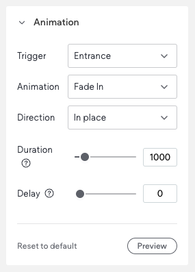
- (Optional) Customize the animation. For example, the direction it enters from. Example animation set up:
To reset the animation, click Reset to Default.
If you are using the Scroll animation, you can click Pause Animation in the side panel to pause all animations while you are working in the editor. The animation will remain on the live site and in preview mode
NOTE
Animations set for Desktop or Tablet screen sizes are linked and will be the same. However, mobile is separate, and animations configured for Desktop and Tablet will not be applied.
Animation Considerations
When adding animations, keep in mind the following:
- Too many animations can disorient or distract users, so use them sparingly
- When removing an animation, remember that animations can be applied to rows as well as widgets, so the animation you are seeing might have been added somewhere unexpected.
Remove Animations
To remove animations:
- To access the design editor, select Edit Design from the floating menu to open the design panel. Click the element to open the floating menu, then click the option to edit design.
- Navigate to the Animation section.
- Click into the Animation drop-down menu and select None.
NOTE
If an element does not have an animation, it could be applied to one of the containers the element is in. It's recommended to check all containers for any possible animations.
Updated 2 months ago