Screen Sizes and Devices
Breakpoints (also called screen sizes) are pixel ranges that correspond to the width of different devices, such as desktop, tablet, and mobile. When the width of a device is within a breakpoints predefined pixel range, the layout of the site is adjusted so the content and design is optimized for that device size and orientation. For example, if I am viewing a site on a desktop computer I can view the full site menu, but when I view the site on my mobile device, I see a hamburger menu instead.
Following are the breakpoints offered in the editor:
- Desktop (1025px-1399px). This is the default breakpoint.
- Tablet (768px-1024px)
- Mobile (767px and below). We always recommend checking mobile breakpoint changes on a mobile device, instead of resizing a desktop screen.
If you make design, layout or content changes to the default desktop breakpoint, the changes are automatically applied to the other breakpoints. If you change content, such as adding a widget, editing text, or adding or deleting a section, the change automatically applies to all other breakpoints, regardless of which breakpoint the change was made on. For example, if you add a widget on the tablet breakpoint, the widget will be added on all other breakpoints as well.
However, if you make changes to the position or size of an element on specific breakpoints, the changes will not apply to other breakpoints. For example, if you change the size of an element on the mobile breakpoint, the change will only apply to the mobile and mobile landscape breakpoints and no other breakpoints.
Overrides Per Screen Size
There are certain times when you need to override a breakpoint. For example, on the main breakpoint an image is to the right of a paragraph, but on mobile you need the image to be on top and the paragraph below.
The following are changes you can make to an element and override the main breakpoint:
- Alignment
- Position
- Size
- Spacing
Once you override a breakpoint, you cannot reverse the change by changing the style in the main breakpoint on the same object.
Hide on a Certain Screen Size
You can hide certain elements on specific breakpoints from the layers panel or from the element’s floating menu. For example, you can hide an image on mobile devices and it will not affect other breakpoints.
NOTE
If you hide an element that has other nested elements within it, all nested elements will also be hidden on that breakpoint. For example, if you hide a flex column it will also hide the widgets within that flex column.
To hide an element on a specific breakpoint:
- Switch to the breakpoint you want to hide the element on by clicking the view in the top navigation.
- Click the element you want to hide.
- Click the three horizontal dots icon on the floating menu and select Hide on this breakpoint.
Or in the layers panel, click Hide on this breakpoint next to the element.
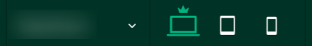
Switch Between Device Views
Responsive websites work on desktop, tablet, and mobile. For this reason, our responsive editor lets you preview the site in each of these views while editing. This lets you check how your site looks on different devices before you publish, ensuring that your customers have a positive experience no matter what device they are using to view the site.
To switch device views, click on one of the device buttons in the top navigation bar:
NOTE:
- The different device views are not separate versions of your site. Deleting an element in one view (for example, mobile), removes that element from the entire site (desktop, tablet, and mobile). Instead of deleting, right-click on the element and select to hide an element on a specific device.
- Device previews do not always reflect precisely what you see on an actual device. Features like fonts, size of the device window, user interface and browser behavior can all cause these previews to be inaccurate to various degrees. For the most accurate version of the site, check on a real device.
Updated 3 months ago