Editor Versions
Website Builder supports two editor versions to best suit your needs:
- Editor 2.0
- Classic Editor with optional flex mode
Each version of the editor is explained in the following sections along with the limitations and future
developments of Editor 2.0.
Editor 2.0
Third Party Store is not supported in Editor 2.0.
Editor 2.0 integrates advanced functionalities while retaining the intuitive interface of the Classic Editor.
However, it introduces an enhanced infrastructure, augmenting your editing experience with improved
capabilities and efficiency:
- Modern Editing Capabilities: Utilizes flex and grid technologies to enhance the editing process and
improve the end result.
- Easily adjust alignment or spacing of multiple elements at the same time (control in one click or slider).
- Easily adjust column configurations with precision, vertically and horizontally.
- Have up to 8 columns in a section.
- Set an uneven number of columns to be the same size.
- Seamlessly nest and overlap elements for dynamic designs using inner columns and advanced grids.
- Responsive Design: Ensures full responsiveness across all screen sizes, reducing the need for manual customization while retaining the option.
- Screen-Size-Specific Editing: Edit across desktop, tablet, and mobile devices, with customization
options tailored to each screen size.
- Edit per screen size rather than by device means, for example, if you view a site on mobile, the site will recognize the size of the screen and display the elements that you set to display on that screen size.
- Edit per screen size allows for continuity across screen sizes, minimizing customization per device. With fewer breakpoints, Editor 2.0 streamlines style management, ensuring smoother cascading of styles and simplifying codebase complexity. Additionally, desktop and tablet screen sizes exhibit greater independence compared to the Classic Editor.
- Consistent Header Design: Maintains header characteristics across screen sizes, such as the logo, facilitating seamless updates. You can update the header on the desktop and it will update on all devices.
- Widget Accessibility: Supports all widgets from the Classic Editor.
- Flex Section Management: Introduces a new flex section management system centralizing flex section reuse in Editor 2.0, including flex sections created in the Classic Editor, to further streamline website creation.
- UI and Editing enhancements:
- Design Panel Location: Resides on the right side of the interface in Editor 2.0, providing a cleaner editing environment. Users also have the option to close the panel when not in use.
- Layer Panel Control: Manage the layer panel easily by closing and reopening it as needed to facilitate smoother navigation within the site structure.
- Floating Bar Navigation: Enables seamlessly backtrack using breadcrumbs by introducing a floating navigation bar.
- Duplicate Option: Enables the convenience of duplicating elements in Editor 2.0 by introducing a duplicate option.
- Inline Image Resizing: Resize images directly within the editor interface, eliminating the need for external editing tools.
- Improved Alignment and Spacing Controls: Enhanced vertical and horizontal alignment and spacing controls, including a spacing slider, streamlines the layout adjustment process. These improvements eliminate the need for additional rows and columns in the Classic Editor.
- eCommerce Store Compatibility: Supports the native store, but does not support the third party store.
Editor 2.0: Future Developments and Current Limitations
Editor 2.0 is a dynamic and evolving feature set, incorporating continuous improvements to enhance the
user experience. While the platform is continuously evolving, various features are under consideration
or in development. Currently in the phase of evaluation and planning:
- Third Party Store
- Mobile editing
- Global Rows (located in the Theme in the Classic Editor).
- New Row Personalization action type.
Classic Editor
The Classic Editor has been a trusted tool known for its simplicity and efficiency in website creation.
You can create beautiful websites just using the Classic Editor or you can also enhance your design
experience by using flex mode in the Classic Editor.
- Easy and Quick Site Creation: The Classic Editor offers a user-friendly interface, allowing users to
create websites swiftly. - Device-Specific Editing: Edit across desktop, tablet, and mobile devices, with customization options
tailored to each device. - Edit per device rather than by screen size means for example if you view a site on mobile, you are
seeing the mobile version of the site. - While you can edit per device, desktop and tablet are closely connected which has its benefits for
simpler layouts. However, this can also increase the time spent on the site if you are creating a
more advanced layout because customization per device is available and sometimes required for
all devices in order to achieve the desired design. - Flexibility with Flex Sections: Incorporate pre-designed Flex Sections and Team Sections to enhance layout flexibility.
- Customizable Header: Customize headers per device, with the exception of tablets mirroring desktop layouts. Note that flex sections are not supported in the header.
- eCommerce Store Compatibility: Supports the Native Store and the Third Party Store.
Flex Sections and Flex Mode Labels
The following explains the different flex section and mode labels and how they relate to the different
editor versions:
- Flex Sections: These are similar to rows in the Classic Editor, it also represents the primary editing
mode within Editor 2.0. Flex was how we called flex sections or flex mode outside of Editor 2.0. - Flex Mode: Relevant to Flex Sections in the Classic Editor, it is not applicable in the Editor 2.0.
- Flex: Relevant to Flex Sections, it is applicable to both the Editor 2.0 and the Classic Editor.
- All-Flex Editor (now known as Editor 2.0): Previously referred to the editor before its transformation into the updated version known as Editor 2.0.
Transition Guidelines and Compatibility Between Editors
For customers concerned about the gradual transition from All-Flex to Editor 2.0 and its impact on the
Classic Editor, here are some important notes:
- Continued Support for Classic Editor: Sites built with the Classic Editor remain fully supported,
with ongoing editing capabilities. - Migration between editor versions: If you do a complete site reset you can switch between editor
versions.
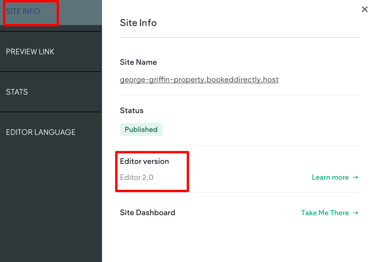
How to Identify the Editor Version Your Site Uses
To easily identify the editor version the site uses, there are labels inside the editor and on the Site
Dashboard.
Inside the Editor
To locate the editor version of the site within the editor, you have two options:
Option 1: Navigate to the top navigation bar and find the device/screen options.
Editor 2.0 sites feature a computer icon with a crown above it.

Classic Editor sites feature a computer icon without a crown above it.
Option 2: Navigate to the top navigation bar and click the Info & Tools tab. Within the Site Info section, locate the Editor Version label. Editor 2.0 sites are labeled Editor 2.0, while Classic are labeled Classic.
Updated 3 months ago