Headers
Headers
The header is the part of your site that contains the logo and navigation. There are a lot of different
ways to control the style of your header to help you create an appealing header for your site.
In the Editor default header offers pre-made layouts, minimizing the risk of accidental changes.
Users can choose layouts with limited actions, ensuring a focused and efficient design experience. An
advanced editing option is also available for users seeking more customization, such as adding extra
widgets or elements, adding empty or predesigned sections, and saving header sections for reuse. For
more information.
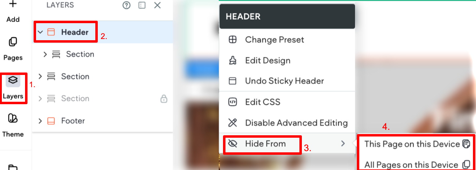
Hide or Unhide Header
You can hide the header for all pages or only for specific pages.
To hide the header:
- Right-click the header to open the context menu.
- Select Hide on this device, then select either From this Page Only or From All Pages.
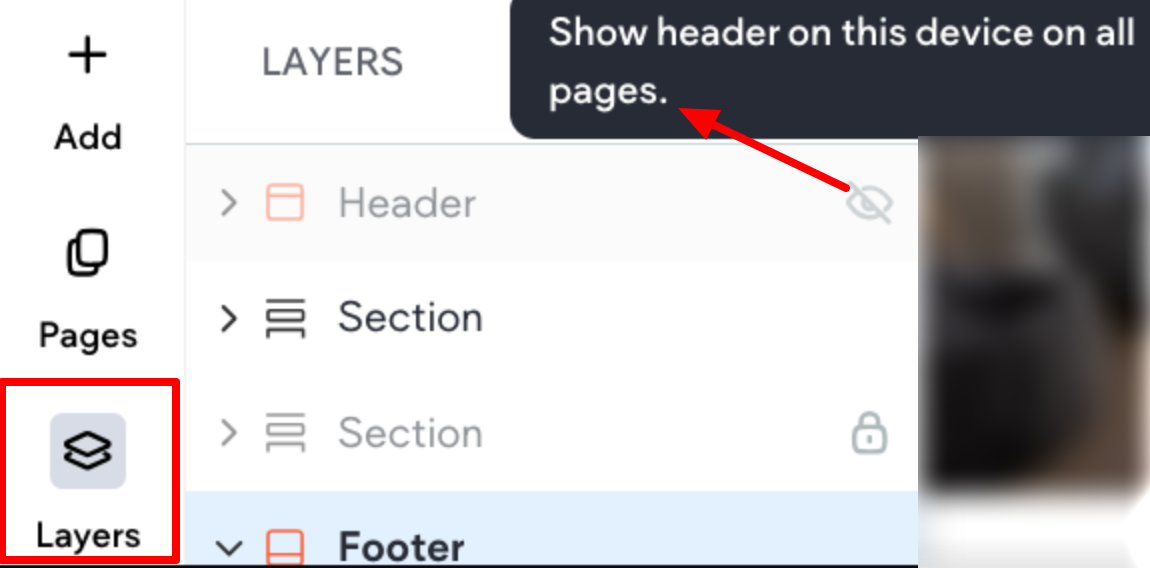
To unhide the header:
- In the side panel, click Layers.
- Locate your header in the panel, then click the crossed-out eye icon next to it.
Hide or Unhide Elements in Header
The flexibility to hide or unhide elements within the header provides you with granular control over the
visual components on different screen sizes whether you want to streamline your design or emphasize
certain elements for specific devices.
Important points to be aware of:
• Any element in the header, including the header itself can be hidden on any screen size. This can be
done either on the canvas or in the Layers panel.
• Elements included in the default header option can be hidden as well.
• Elements that are hidden will show as disabled with a hide element icon.
• The layers panel will only indicate elements hidden for the screen size you are currently on. For
instance, if you are on desktop, it will only indicate elements hidden on desktop.
To hide header elements from the Layers panel:
- In the top toolbar, click on the desired screen size you would like to hide the element on.
- In the side panel, click Layers.
- Click on the element you like to hide.
- Click on the hide element icon.
To unhide header elements from the Layers panel:
- In the top toolbar, click on the desired screen size you would like to hide the element on.
- In the side panel, click Layers.
- Click on the element you like to unhide (it will show disabled with the crossed out eye icon prior to\
being selected).
- Click on the hide element icon.
Scroll On Header (Shrinking Header)
The Scroll on Header feature keeps essential navigation elements like the logo and menu visible at
the top of the screen as users scroll down the page. It condenses logos and the general size of the
header to save space and ensure easy access to navigation without being intrusive. Ideal for sites with
large headers or those designed for extended scrolling, it enhances user experience by maintaining
accessibility to key navigation options.
Enable Scroll on Header
It is important to note that sticky header must already be enabled before the scroll on header may be
enabled.
To enable scroll on header:
- Hover over the header, and click Header.
- Click Edit Design. The Header Design panel will appear.
- Expand the Position section, and enable the Set as sticky header toggle if it is not already\
enabled.
- Enable the Change header on scroll toggle.
- Configure the following design options:\
• Padding. Set the headers initial padding-top and padding-bottom values (this is not specific to
the sticky header option).
• BG on scroll. Select the background color and opacity. Changes made on any screen size will
affect the others.
• Spacing on scroll. Define the top and bottom padding in px, %, vh, or vw. If you want to override
the desktop screen size settings, you can make edits on tablet and mobile.
• Logo size. Use the slider or text box to specify the size the logo shrinks to when the header
shrinks on scroll. The default is 66%. Changes must be made on individual screen sizes.
• Show only nav section on scroll. In the Position section, enable the Show only nav section on
scroll toggle to keep only the navigation visible when scrolling. All other sections in the header
will disappear on scroll.
Note this option is only available for advanced headers.
Changes made in the Layout section of the Header Design Panel do not affect the Position settings.
Overlap Header with First Row
You have the flexibility to set your header to overlap with the content in the first row of the page.
This can create a visually appealing effect where the header seamlessly integrates with the content. If
desired, you can set the header to overlap the first row. This needs to be enabled per page.
To enable overlap header with first row:
- Hover over the header, and click Header.
- Click Edit Design. The Header Design panel will appear.
- Expand the Position section, and enable the toggle for Overlap 1st section on page.
- (Optional) Configure a background color that will apply to all screen sizes.
Widgets Compatible with Shrinking Headers
Not all widgets are compatible and appear in the shrinking header. If you have a widget in the header
that is not compatible with the shrinking header, a blank column appears in place of the widget. You
cannot edit widgets when the header is shrunk.
The following widgets are compatible and will display in a shrinking header:
• Navigation
• Multi-language
• Social Icons
• Click to Call button
• OpenTable button
• Click to Email button
• vcita
• PayPal button
• Facebook Like button
• Images and Logos
• Paragraph widget
• Title widget
• Buttons
Sticky Headers
A sticky header becomes static and stays in place when you scroll through pages in your site.
To enable a sticky header:
- Hover over the header, click Header, and then click Edit Design.
- On the Content tab, select Set As Sticky Header. If the option for Sticky Header is not available,\
you need to disable the toggle for Shrinking Header on the Shrinking Header tab.
Header Layouts
There are several pre-designed flexible header layouts to select from. If you switch to one of the
pre-designed flexible header layouts, you cannot switch back to a fixed header, you can only switch
between other flexible header layouts. Switching layouts also removes existing content from the header
section. We recommend creating a backup before switching layouts.
To change the header layout:
- Hover over the header and click Header.
- On the Design tab, select a new header layout. If you are switching to a sticky header, you first\
need to disable the toggle for Shrinking Header on the Shrinking Header tab.
Hamburger Site Layout
You can enable a hamburger site layout on desktop. By default, tablet and mobile use the hamburger
layout.
To enable the Hamburger site layout:
- Click your header label and select Change Preset in the floating menu. Note that this is the same\
whether you have a Basic or Advanced header.
- In the design panel, the Presets section will open. Select the Hamburger icon next to Browse\
menu presets. Note that no change will be reflected on the canvas yet.
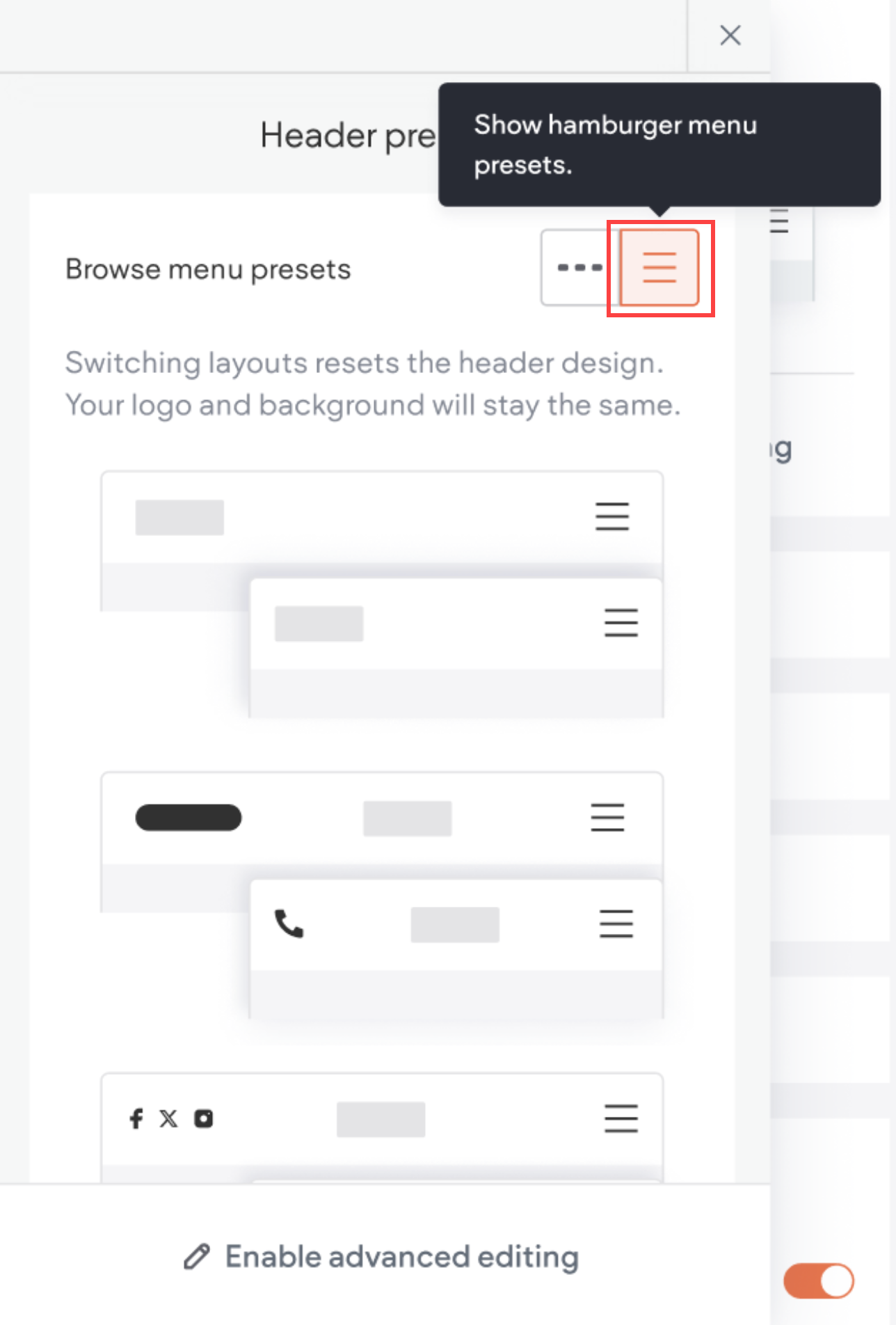
- Select the desired hamburger layout. The selected layout will display on the canvas.
- When you are satisfied with the layout, exit the Presets popup.
Note that when changing presets, some customizations may reset. Background color and logo will
remain the same.
Header Design
To access the header design menu, hover over the header, click Header, then click Edit
Design. The design panel will open on the side of the canvas. It contains the following design options:
• Layout: Explore layout options that pair top navigation and hamburger styles consistently across
screen sizes. While default layouts have limited capabilities, an advanced editing option enhances
flexibility.
• Spacing: Set margins and padding, with changes on the desktop affecting other screen sizes if their
spacing remains unaltered.
• Background: Choose background color or image, add borders or shadows, and witness changes
seamlessly reflected across all screen sizes.
• Position: Enable a sticky header with scroll-based changes. Sticky header activation on any screen
size influences the behavior on others.
Header Logo
If the header contains one image, the logo of the site will be kept when moving between header layouts.
In the case there is more than one image, or the logo is textual, the logo image is kept as in the layout.
It is important to note that the headers between devices are not connected, so if you add a logo on
desktop it is not automatically added to the other device types. The only exception is if the top bar
header layout is used on tablet it will inherit any logo changes made on desktop.
If you delete the logo, re-add the image by dragging the image element back into the header, and set
the link to go back to the homepage.
Display Header Items Above Hero Image
To display header items above hero images, hover over the header, click Header, click the Design tab,
then click Overlap first row. This gives your hero images more visibility and makes it easier to design
great-looking, trendy sites.
Keep the following in mind:
• For the header. Set the background color to transparent, or a color with opacity.
• For the first row. Use top padding that is equal to or similar to the height of the header.
📘 NOTE
For added flexibility, this setting applies only to the current page. To enable it on other
pages, navigate to each page and follow the steps above.
Advanced Header Editing
Advanced editing allows you further customize the header, such as adding widgets, elements, and
empty or predesigned sections. You can also save individual header sections and reuse them.
📘 NOTE
• Changing the header layout (in the Header Design panel) will reset any changes that
were made and will disable advanced editing.
• Because the headers sync across the screen sizes, it is recommended to check all
screen sizes when using the advanced editing option.
Enable Advanced Header Editing
When using advanced editing, it's recommended to check all screen sizes due to header synchronization.
To enable advanced editing:
- Click on the Header tab.
- Click Edit Design.
- In the Layout section, click Enable advanced editing.
If you plan to display different elements on desktop and mobile (e.g., a button on desktop and an icon
on mobile), utilize the hide/show feature for seamless transitions.
Disable Advanced Header Editing and Reset Header
To disable advanced editing and reset header, select a different layout:
- Click the Header tab.
- Click Edit Design.
- Within the Layout section, click the arrow to access layout options.
- Select a different layout to disable advanced editing and reset the header. Any changes made\
using advanced editing will be reverted and not saved.
Updated on: 12/05/2026
Thank you!