> ## Knowledge Base Index
> Fetch the complete knowledge base index at: https://support.uplisting.io/sitemap.xml
> Use this file to discover available pages before exploring further.
> Pure-Markdown content can be obtained by appending a '.md' suffix to the content URLs listed in the sitemap (without the trailing slash).
# Flex Design Panel
# Flex Design Panel
Flex is a mode for designing pixel perfect, responsive sections with additional design capabilities. If you
are using the Classic Editor, you can enter flex mode to design. If you are using Editor 2.0, you use flex
by default.
## Flex Design Panel
The design panel displays on the right side of flex mode and contains your design properties for
the selected element (section, column, widget, Inner Column, or advanced grid). Each element has
different properties that can be adjusted in the design panel, meaning the design properties are different
depending on which element is selected. The design properties include alignment, layout, spacing,
sizing, and more, depending on the selected element.
To open the design panel, click an element while in flex mode, then click *Design*. The design panel
opens on the right side of flex mode so that it does not interfere with your ability to view and edit your
design. Or, you can click the *Edit design* icon in the floating menu. After closing the design panel, you
can open it again by clicking the *Edit design* icon in the top right corner.
 ## Design Panel Sections
The design panel is comprised of 5 sections: Align, Layout, Spacing, Size, and Animation and Background. Following is a description of each section and what you can accomplish.
### Align
Available for single elements inside a column or Inner Column. Single elements inside a column or
vertical Inner Column with vertical auto layout can be aligned left, center, right, or stretched horizontally
to fit 100% of its container width.
Elements can also be aligned from the floating menu by clicking the *Align* icon.
### Layout
#### Full Width
Previously named "full bleed", full width is available only for sections and can only be changed from
the desktop main breakpoint. When toggled to On, it allows the content to span the entire width of the
screen. When toggled to Off, the content width can span a maximum of 1920 pixels. By default, the full
width setting is toggled to Off. To learn more about breakpoints, see [Screen Sizes and Devices.](https://uplisting.crisp.help/en/article/screen-sizes-and-devices-uzlp/)
#### Align Elements
Allows you to vertically align multiple elements in a column or Inner Column at once. In the classic
editor, elements can only be aligned individually and horizontally. Vertical alignment is helpful because
it keeps the position of the elements consistent between all breakpoints without making additional
adjustments. For more information, see [Alignment and Spacing](https://uplisting.crisp.help/en/article/size-units-flex-elements-1xtcikv#size-units)
#### Auto Layout
Allows you to select whether elements inside columns and Inner Columns are automatically aligned
horizontally or vertically. By default, elements are vertically aligned. Elements can only be moved in
the same direction as the auto layout alignment. For example, if elements are aligned vertically, you
can only move the elements vertically and not horizontally. The auto layout helps ensure your design is
optimized to match any breakpoint.
#### Wrap
Available for columns and Inner Columns only when Stack Horizontally is selected for auto layout.
When set to Wrap, it allows elements inside the column or Inner Column to keep their dimensions and
wrap as the screen width changes.
#### Align Rows
Available for columns and Inner Columns only when Wrap is selected for auto layout. Allows you to set
the alignment of rows within a column or Inner Column. This setting does not affect the alignment of
elements inside rows, just the rows themselves.
### Spacing
#### Space Between Items
Allows you to set the space in between columns or widgets once and it applies to all columns in a
section or all widgets in a column. For columns, if the auto layout property is set to vertical, the space
between widgets is measured in pixels. If the auto layout is horizontal, the space between widgets
is measured in percentages. This property is not applicable for elements inside Inner Columns or
advanced grids.
#### Set Margins and Padding
Margins are the space between the element's border and the edge of the section, column, Inner
Column, or advanced grid it is contained within. By default, the horizontal margin and padding values
are linked. If you adjust the left value, the right side value will automatically update to match. If you do
not want the values linked, click the *link* icon.
Note that inline margins for elements inside columns or inner columns can be adjusted directly on the
canvas. To learn more, see [Outer and Inner Spacing](https://uplisting.crisp.help/en/article/outer-and-inner-spacing-h91lek/)
## Design Panel Sections
The design panel is comprised of 5 sections: Align, Layout, Spacing, Size, and Animation and Background. Following is a description of each section and what you can accomplish.
### Align
Available for single elements inside a column or Inner Column. Single elements inside a column or
vertical Inner Column with vertical auto layout can be aligned left, center, right, or stretched horizontally
to fit 100% of its container width.
Elements can also be aligned from the floating menu by clicking the *Align* icon.
### Layout
#### Full Width
Previously named "full bleed", full width is available only for sections and can only be changed from
the desktop main breakpoint. When toggled to On, it allows the content to span the entire width of the
screen. When toggled to Off, the content width can span a maximum of 1920 pixels. By default, the full
width setting is toggled to Off. To learn more about breakpoints, see [Screen Sizes and Devices.](https://uplisting.crisp.help/en/article/screen-sizes-and-devices-uzlp/)
#### Align Elements
Allows you to vertically align multiple elements in a column or Inner Column at once. In the classic
editor, elements can only be aligned individually and horizontally. Vertical alignment is helpful because
it keeps the position of the elements consistent between all breakpoints without making additional
adjustments. For more information, see [Alignment and Spacing](https://uplisting.crisp.help/en/article/size-units-flex-elements-1xtcikv#size-units)
#### Auto Layout
Allows you to select whether elements inside columns and Inner Columns are automatically aligned
horizontally or vertically. By default, elements are vertically aligned. Elements can only be moved in
the same direction as the auto layout alignment. For example, if elements are aligned vertically, you
can only move the elements vertically and not horizontally. The auto layout helps ensure your design is
optimized to match any breakpoint.
#### Wrap
Available for columns and Inner Columns only when Stack Horizontally is selected for auto layout.
When set to Wrap, it allows elements inside the column or Inner Column to keep their dimensions and
wrap as the screen width changes.
#### Align Rows
Available for columns and Inner Columns only when Wrap is selected for auto layout. Allows you to set
the alignment of rows within a column or Inner Column. This setting does not affect the alignment of
elements inside rows, just the rows themselves.
### Spacing
#### Space Between Items
Allows you to set the space in between columns or widgets once and it applies to all columns in a
section or all widgets in a column. For columns, if the auto layout property is set to vertical, the space
between widgets is measured in pixels. If the auto layout is horizontal, the space between widgets
is measured in percentages. This property is not applicable for elements inside Inner Columns or
advanced grids.
#### Set Margins and Padding
Margins are the space between the element's border and the edge of the section, column, Inner
Column, or advanced grid it is contained within. By default, the horizontal margin and padding values
are linked. If you adjust the left value, the right side value will automatically update to match. If you do
not want the values linked, click the *link* icon.
Note that inline margins for elements inside columns or inner columns can be adjusted directly on the
canvas. To learn more, see [Outer and Inner Spacing](https://uplisting.crisp.help/en/article/outer-and-inner-spacing-h91lek/)
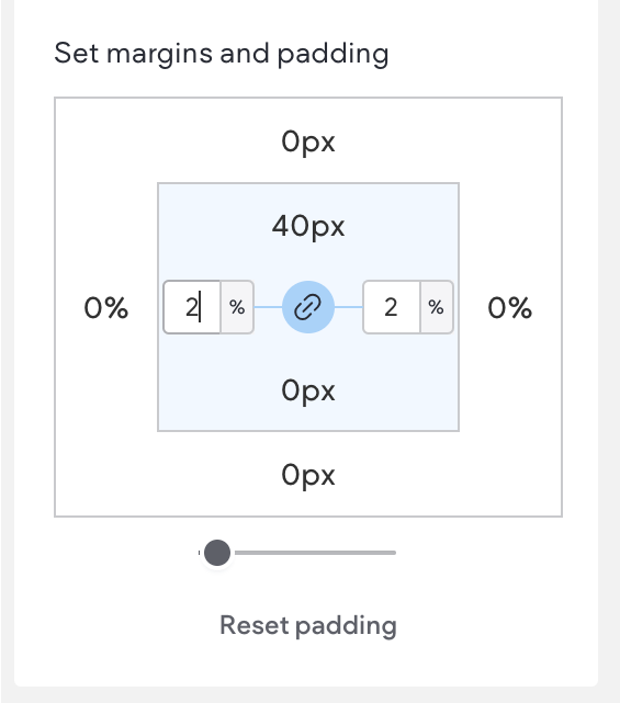 Padding is the inner space of the element. Click the margin or padding number to type a new value,
then use the drop down menu to select the unit the space is measured in (px, %, vh, or vw). By default,
horizontal spacing is measured in percentages, and vertical spacing is measured in pixels.
For example, if you select a column and set the left padding to 5 px, it will add 5 px of space between
the left edge of the column and the outer edge of the elements inside the column. If, for that same
column, you set the left margin to 5 px, it will add 5 px of space between the edge of the column and the
edge of the section that contains it.
#### Reset Padding or Margin
When clicked in the design panel or floating menu, it resets the padding or margins for the selected
element to zero.
## Size
Depending on the selected element, you can adjust the height and width, and the maximum and
minimum values. In flex mode, height can be measured in px, vh, percentage, and A. However, the
height of flex columns and space between columns can only be measured in percentage. To learn more
about size units, see [Size Units](https://uplisting.crisp.help/en/article/size-units-flex-elements-1xtcikv/)
The default size units are different for each element. For example, by default text boxes are 100% width
buttons are 280px width.
For sections, you can only change the height. Section width is set by the device, while the width of the
content in the section is set by the Content Width setting in Site Theme. For columns, you can only
change the width height is defined by the section height or by its inner elements. For Inner Columns
and widgets you can set the height and width, along with the minimum and maximum values for each.
Any size unit can be used.
## Animation and Background
The animation and background properties in flex mode are similar to the classic editor.
Following is a list of available triggers and animations:
* Animations for *Hover* trigger (Editor 2.0 only)
* Grow
* Shrink
* Move top
* Move bottom
* Move right
* Move left
* Rotate
* Opacity
* Grayscale
* Shadow
* Animations for Scroll trigger
* Fade
* Slide
* Bounce
* Roll
* Rotate
* Zoom
* Flip
* Animations for Entrance trigger:
* Fade in
* Slide in
* Bounce in
* Rotate in
* Roll in
* Zoom in
* Flip in
* Flash
* Pulse
* Rubber band
* Shake
* Swing
* Tada
* Wobble
> **📘 NOTE**
> Parallax is available for all widgets and containers, and can be applied on all screen
> sizes. To enable parallax, click the image, select *Edit Design*, scroll to the Background section of the design panel and open the Image Position menu.
> The option to keep a background image static is not available for tablet, mobile, and
> Mac OS due to an iOS limitation.
## Design Panel for Advanced Grids
Advanced grids have design panel properties that are not available for other element types due to the ability to create freestyle compositions and overlapping elements. We recommend you review your design at different breakpoints.
### Align
Single elements in an advanced grid can be aligned and stretched in any direction because it is not constrained by auto layout.
### Order
In the *Arrangement section* of the design panel, this property can only be used when there are multiple elements inside an advanced grid. Allows you to bring a selected element to the front, forwards, to the back, or backwards. For more information, see [Create Overlapping Elements](https://uplisting.crisp.help/en/article/canvas-actions-and-options-1kfdxni/)
### Rearrange Layout
Allows you to select how the columns and rows are arranged within the advanced grid to create a layout.
### Customize Layout
Allows you to select how the columns and rows are arranged within the advanced grid to create a layout.
### Pin
Allows you to define the element’s position within the grid. Once set, the element will stay in the same position even when the grid size changes.
### Grid Location
Available for elements inside advanced grids that have been divided into columns and or rows to create a layout. It shows where the element is on the grid.
### Keep Proportions
When toggled to On, it ensures the elements inside an advanced grid retain their proportions even when the size of the grid changes.
The Image widget also contains a Keep proportion toggle, which keeps its original proportions.
Padding is the inner space of the element. Click the margin or padding number to type a new value,
then use the drop down menu to select the unit the space is measured in (px, %, vh, or vw). By default,
horizontal spacing is measured in percentages, and vertical spacing is measured in pixels.
For example, if you select a column and set the left padding to 5 px, it will add 5 px of space between
the left edge of the column and the outer edge of the elements inside the column. If, for that same
column, you set the left margin to 5 px, it will add 5 px of space between the edge of the column and the
edge of the section that contains it.
#### Reset Padding or Margin
When clicked in the design panel or floating menu, it resets the padding or margins for the selected
element to zero.
## Size
Depending on the selected element, you can adjust the height and width, and the maximum and
minimum values. In flex mode, height can be measured in px, vh, percentage, and A. However, the
height of flex columns and space between columns can only be measured in percentage. To learn more
about size units, see [Size Units](https://uplisting.crisp.help/en/article/size-units-flex-elements-1xtcikv/)
The default size units are different for each element. For example, by default text boxes are 100% width
buttons are 280px width.
For sections, you can only change the height. Section width is set by the device, while the width of the
content in the section is set by the Content Width setting in Site Theme. For columns, you can only
change the width height is defined by the section height or by its inner elements. For Inner Columns
and widgets you can set the height and width, along with the minimum and maximum values for each.
Any size unit can be used.
## Animation and Background
The animation and background properties in flex mode are similar to the classic editor.
Following is a list of available triggers and animations:
* Animations for *Hover* trigger (Editor 2.0 only)
* Grow
* Shrink
* Move top
* Move bottom
* Move right
* Move left
* Rotate
* Opacity
* Grayscale
* Shadow
* Animations for Scroll trigger
* Fade
* Slide
* Bounce
* Roll
* Rotate
* Zoom
* Flip
* Animations for Entrance trigger:
* Fade in
* Slide in
* Bounce in
* Rotate in
* Roll in
* Zoom in
* Flip in
* Flash
* Pulse
* Rubber band
* Shake
* Swing
* Tada
* Wobble
> **📘 NOTE**
> Parallax is available for all widgets and containers, and can be applied on all screen
> sizes. To enable parallax, click the image, select *Edit Design*, scroll to the Background section of the design panel and open the Image Position menu.
> The option to keep a background image static is not available for tablet, mobile, and
> Mac OS due to an iOS limitation.
## Design Panel for Advanced Grids
Advanced grids have design panel properties that are not available for other element types due to the ability to create freestyle compositions and overlapping elements. We recommend you review your design at different breakpoints.
### Align
Single elements in an advanced grid can be aligned and stretched in any direction because it is not constrained by auto layout.
### Order
In the *Arrangement section* of the design panel, this property can only be used when there are multiple elements inside an advanced grid. Allows you to bring a selected element to the front, forwards, to the back, or backwards. For more information, see [Create Overlapping Elements](https://uplisting.crisp.help/en/article/canvas-actions-and-options-1kfdxni/)
### Rearrange Layout
Allows you to select how the columns and rows are arranged within the advanced grid to create a layout.
### Customize Layout
Allows you to select how the columns and rows are arranged within the advanced grid to create a layout.
### Pin
Allows you to define the element’s position within the grid. Once set, the element will stay in the same position even when the grid size changes.
### Grid Location
Available for elements inside advanced grids that have been divided into columns and or rows to create a layout. It shows where the element is on the grid.
### Keep Proportions
When toggled to On, it ensures the elements inside an advanced grid retain their proportions even when the size of the grid changes.
The Image widget also contains a Keep proportion toggle, which keeps its original proportions.